
Going on Vacation
עברית למטה Hi Quilters! I know it’s been a really long time since I’ve posted anything. It’s been a hard, sad, scary and crazy year
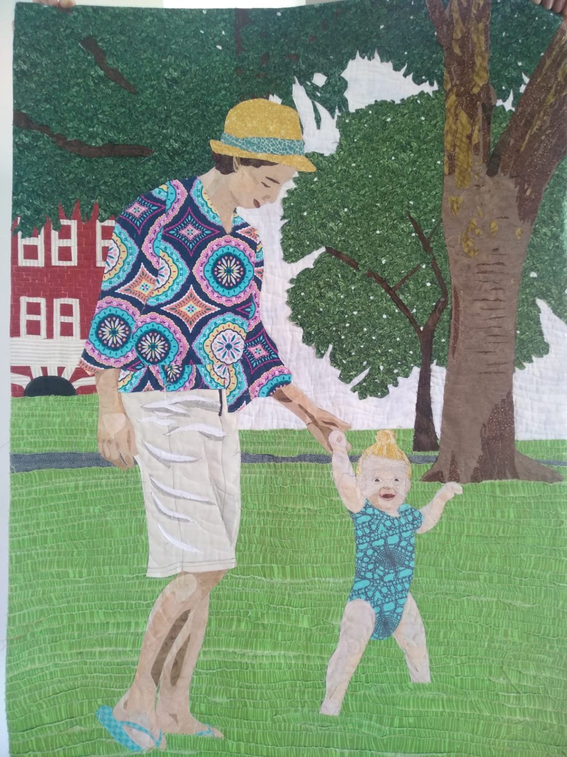
How exciting! I just finished an art quilt that I’ve been working on for about a year. To be fair, I haven’t been working on it exclusively. I’ve been giving it a few hours a month, but the months are over, and I have this piece of art to hang in my home. It felt so good to sew the final stitches.
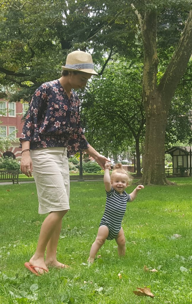
When I started this quilt, my grandson still had long hair. He looked a lot more like his baby picture here. Now he’s a rough and tumble little kid. My, how time goes by.
Here’s the image that I started with:
This is my rendition in fabric:
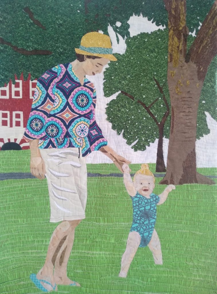
Before I go any future, the first thing that I would like to do is thank Cindy Richard for her help in creating this quilt. She’s an art quilting master and she has been holding my hand through this whole process.
The quilt is made up of layers of fabric that have been fused together and then quilted to add depth.
I took some creative license with this quilt. I cut out a lot of the background. I wanted to simplify the quilt and make sure not to draw focus to things that don’t add that much value. My main focuses were the large tree in the background, my daughter-in-law, and of course my very yummy grandson.
The grass in the background is made up of ripped pieces of fabric. Each length of fabric is fraying, which gives it a 3D grassy look.
I found the tree fabric online. It’s so perfect. It was really a lucky find. I found it a bit nerve-racking to randomly cut holes in it because I only have a limited amount of it. No mistakes were allowed. I’m a mathematical person by nature. Even when I tried to be random, things came out very evenly spaced. I had to throw caution into the wind and just chop away. I think it came out pretty good.
I think that I put the most work into my grandson’s face. Getting his likeness was very tricky. I actually made his face twice. The first time just didn’t work at all. Getting the shading right was particularly difficult. I started with the image and then I posterized it. (More on that in my next blog post.) One thing that I learned is that not all areas should be posterized to the same level. Although I used level 5 for the rest of the quilt, I redid the image with level 4 and it came out much better.
My daughter-in-law’s neck was in too much shadow in the image. I took care of that in my version as well.
It’s hard to see in these photos, but the quilting gives the figures more depth. I quilted it to emphasize curves. I used mono-filament thread. It adds texture without adding color. I may go back and add a bit more stitching with colored thread to add a bit more depth.
All-in-all, I’m very pleased with how it came out. I can’t wait to start the next one!

עברית למטה Hi Quilters! I know it’s been a really long time since I’ve posted anything. It’s been a hard, sad, scary and crazy year
עברית למטה Wow! What a year it’s been. It’s hard to believe that Rosh Hashana is here already. How exciting! There are so many things
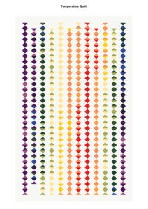
עברית למטה As the year ends and the temperature drops it’s time to think about making a temperature quilt. It’s more fun to quilt when
WhatsApp us